
Identifying and Drawing Supply and Demand Zones
In financial markets, for every buyer, there is always a seller, and for every seller, there is always a buyer. If that is true, then what causes prices to move? The answer lies in the aggressiveness of one side versus the other. When sellers become aggressive and hit the bids, they push prices lower. Similarly, when buyers are aggressive and hit the ask prices, they drive prices higher. This aggressiveness is what creates supply and demand zones—areas of imbalance where significant buying or selling pressure existed, leading to sharp price movements. Understanding how to identify and draw these zones is a foundational skill for any trader.
Understanding Supply and Demand Zones
Supply Zone: An area where aggressive selling occurred, overwhelming buyers and causing the price to drop. These zones are typically found at or near recent highs.
Demand Zone: An area where aggressive buying occurred, overwhelming sellers and driving the price higher. These zones are typically found at or near recent lows.
These zones (usually but not always) represent areas of unfilled institutional orders and serve as key reference points for potential price reversals or continuations. Remember the keyword: these zones are reference points only and not an automatic buy or sell area when price revisits. We will cover their usage in upcoming lessons
Steps to Identify and Draw Supply and Demand Zones
. Identify the Aggressive Move
Look for areas on the chart where price moves sharply upward or downward. These aggressive moves indicate strong buying or selling activity.
Mark the origin of the move, as it highlights the zone where the imbalance began.
2. Pinpoint the Base
Focus on the consolidation area (the base) that occurred before the sharp move. This base represents the buildup of orders.
The base should have relatively small candles with minimal overlap, indicating balance before the imbalance.
3. Validate the Zone
Confirm the sharp move with increased volume, as this indicates strong participation.
Check if the zone is fresh (not revisited by price). Fresh zones are more likely to hold.
4. Refine on Lower Timeframes
Use higher timeframes (Monthly, Weekly and Daily) to identify major zones, then refine the zone boundaries on lower timeframes (4 Hour, 2 Hour, 1-hour or 15-minute etc.).
How to Draw the Zones
There are multiple ways to mark supply and demand zones, and with time you will adapt to the method that suits your style. If a zone is too large or price penetrates deep into it on the first impact, you must drill down to a lower timeframe and redraw the zone using the same principles. For example, a weekly zone might not react precisely; you will need to analyze the weekly candle and break it down into daily, 4-hour, or even 1-hour zones to refine it to the precise level that produces a response.
Use the following general guidelines to draw supply and demand zones effectively:
Demand Zone:
If there is only one candle at the basing area (commonly on higher timeframes), draw a rectangle from the open of the red candle to the low of the wick.
If there are multiple candles in the basing area, draw the rectangle from the highest open to the lowest wick across the basing candles.
Supply Zone:
If there is only one candle at the basing area (commonly on higher timeframes), draw a rectangle from the open of the green candle to the highest wick.
If there are multiple candles in the basing area, draw the rectangle from the lowest open to the highest wick across the basing candles.
Please note that at times, the price may reverse just before reaching the zone. This typically occurs when there are significant wicks in the basing area. We will explore this concept further in our upcoming lesson on support and resistance.
Types of Supply and Demand Zones
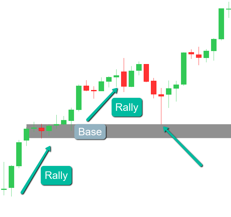
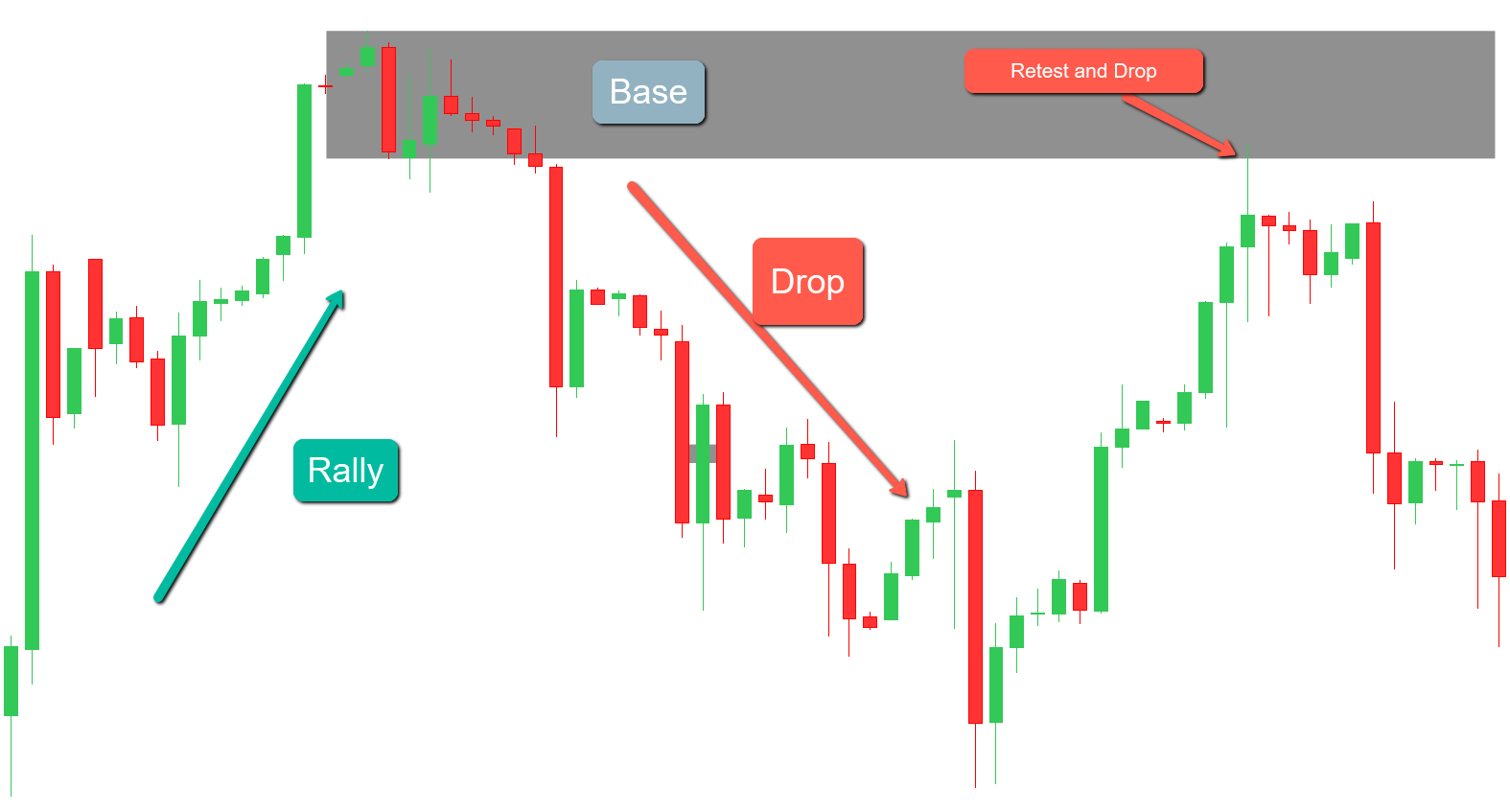
1. Rally-Base-Rally (RBR):
Pattern Description: The price experiences a sharp Rally, enters a brief consolidation phase (the base), and then resumes its Upward movement.
Identifying the Supply Zone: To mark this zone, draw a rectangle around the consolidation area preceding the second Rally. This highlights the Demand zone, indicating where Buying pressure may re-emerge upon a retest.
Lower Time Frame Patterns: Within an RBR pattern, the base often appears as bullish chart formations on lower time frames, such as a base on 4h candle will likely be a bull flag, Ascending triangle, or bull pennant on 15 min candles. These patterns represent a consolidation phase before the price continues its Upward trajectory.
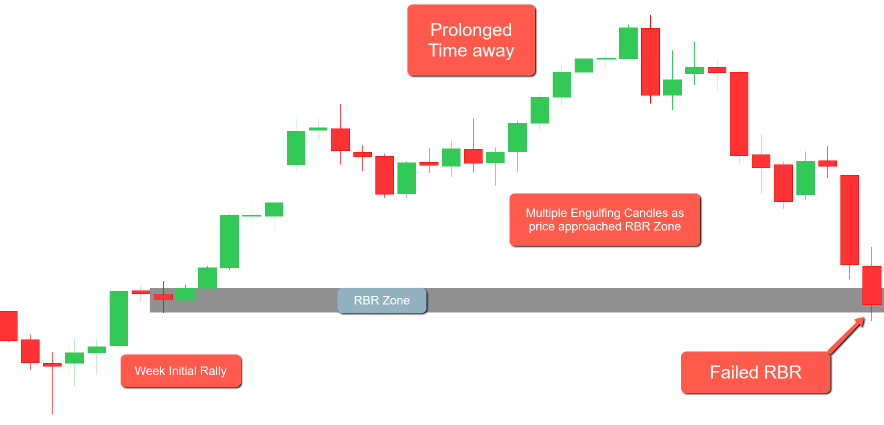
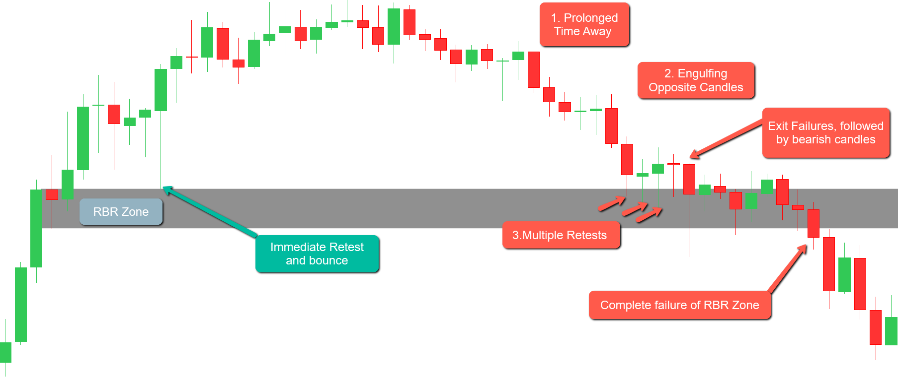
A Rally-Base-Rally (RBR) pattern signifies a demand zone where price rallies, consolidates (forming a base), and then rallies again. Traders often anticipate that upon retesting this demand zone, the price will rebound upward. However, there are instances when the RBR demand zone fails to hold during a retest, leading to a price decline through the zone. Several factors can contribute to this failure:
Weak Initial Momentum: The strength of the initial rally preceding the base is crucial. If the upward movement lacks significant momentum, it may indicate insufficient buying interest, making the demand zone less likely to hold upon retest.
Prolonged Time Away from the Zone: The duration for which the price remains away from the demand zone matters. Zones where the price has stayed away for an extended period may become less effective, as institutional traders are unlikely to leave unfilled orders in the market for so long.
Multiple Retests: Demand zones are most effective during the first retest. Each subsequent retest can weaken the zone as remaining buy orders get absorbed, increasing the likelihood of failure.
Formation During Established Trends: RBR zones that form in the middle of an existing uptrend may be less reliable. In such cases, the majority of traders are already buying, leaving fewer opposing sell orders for institutional traders to execute substantial buy trades. This can result in a weaker demand zone that’s more prone to failure upon retest.
Engulfing Candles in Opposite Direction: The appearance of a strong bearish engulfing candle within or near the demand zone during a retest can signal increased selling pressure, suggesting that the zone may not hold.
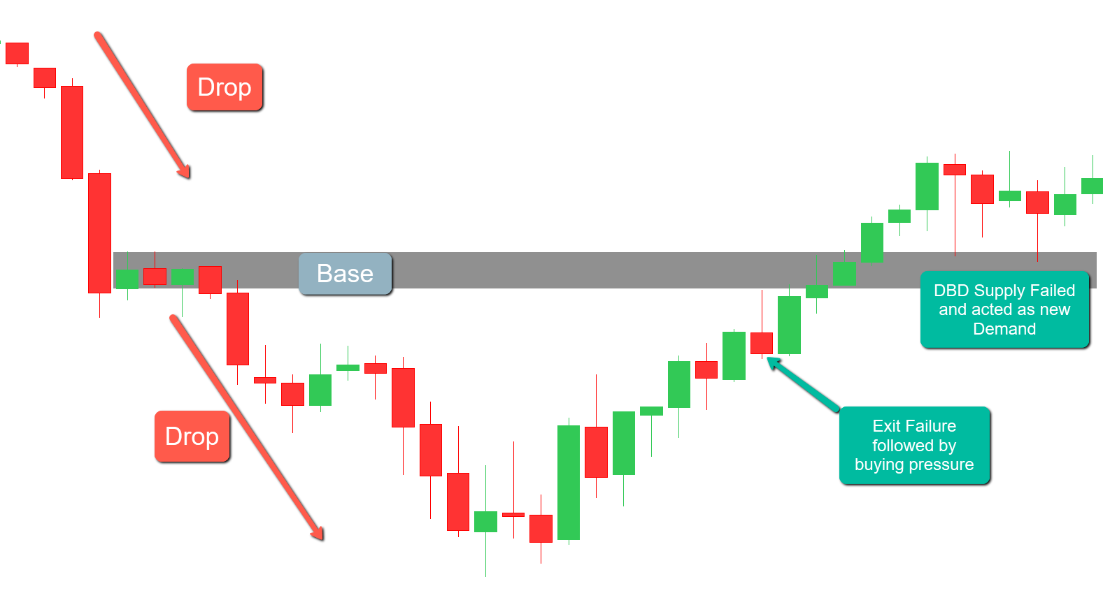
Exit Failures: If, upon retesting the demand zone, the price initially moves in the anticipated upward direction but then reverses to form a bearish pin bar, it indicates that the buying pressure was insufficient to sustain the move, leading to a potential failure of the demand zone.
Understanding these factors can help traders assess the strength of an RBR demand zone and make more informed decisions about the likelihood of its success or failure upon retest.
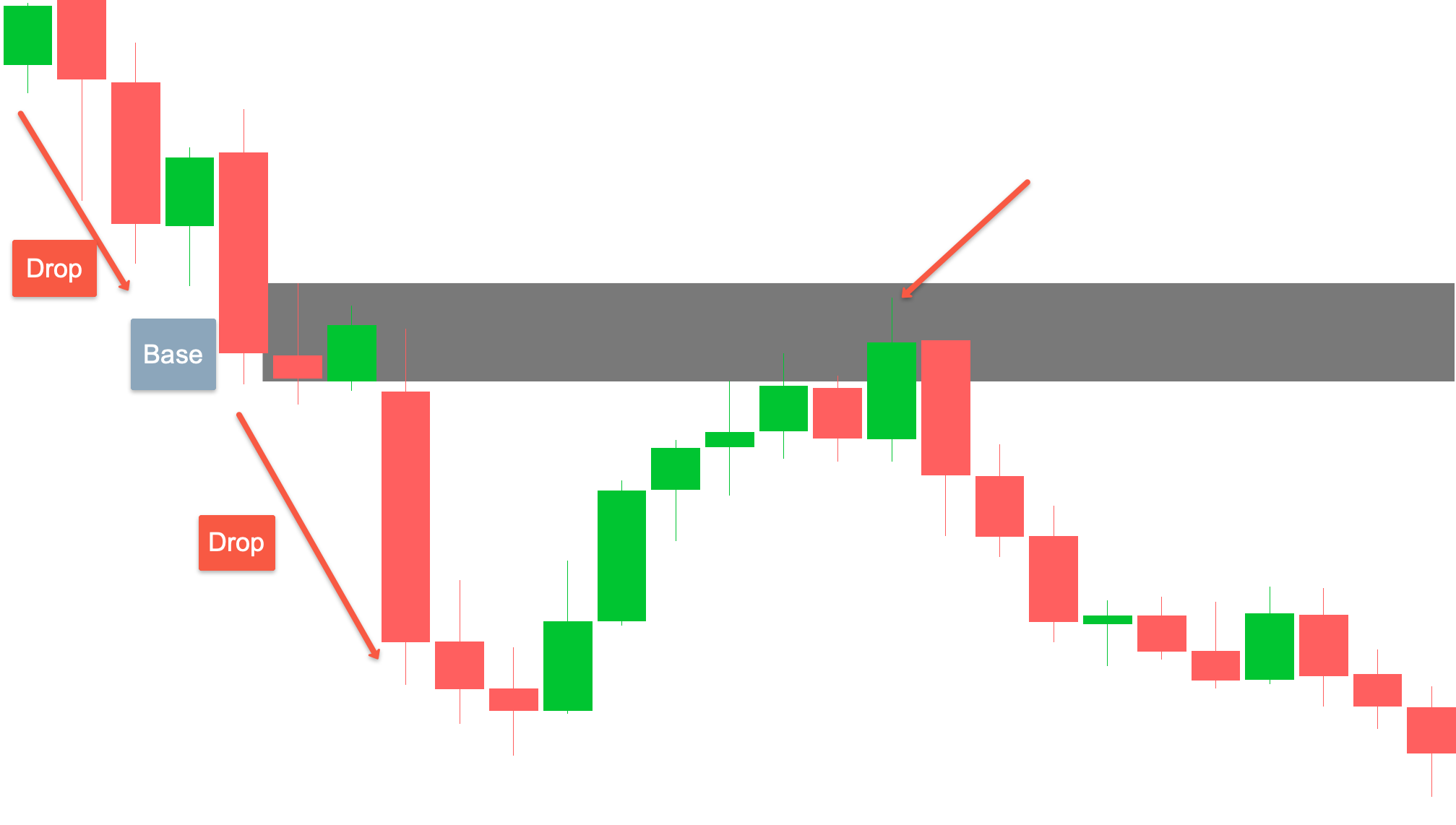
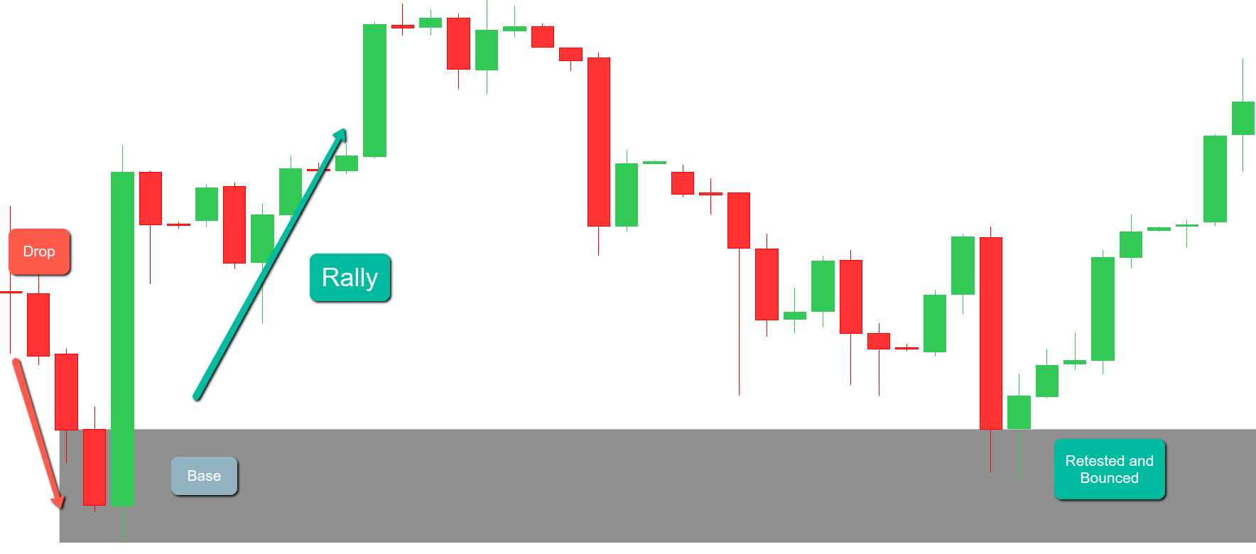
2. Drop-Base-Drop (DBD):
Pattern Description: The price experiences a sharp decline, enters a brief consolidation phase (the base), and then resumes its downward movement.
Identifying the Supply Zone: To mark this zone, draw a rectangle around the consolidation area preceding the second drop. This highlights the supply zone, indicating where selling pressure may re-emerge upon a retest.
Lower Time Frame Patterns: Within a DBD pattern, the base often appears as bearish chart formations on lower time frames, such as a base on 4h candle will likely be a Bear flag, descending triangle, or bear pennant on 15 min candles. These patterns represent a consolidation phase before the price continues its downward trajectory.
Traders often anticipate that upon retesting this supply zone, the price will rebound downward. However, there are instances when the DBD supply zone fails to hold during a retest, leading to a price increase through the zone. Several factors can contribute to this failure:
Weak Initial Momentum: The strength of the initial drop preceding the base is crucial. If the downward movement lacks significant momentum, it may indicate insufficient selling interest, making the supply zone less likely to hold upon retest.
Prolonged Time Away from the Zone: The duration for which the price remains away from the supply zone matters. Zones where the price has stayed away for an extended period may become less effective, as institutional traders are unlikely to leave unfilled orders in the market for so long.
Multiple Retests: Supply zones are most effective during the first retest. Each subsequent retest can weaken the zone as remaining sell orders get absorbed, increasing the likelihood of failure.
Formation During Established Trends: DBD zones that form in the middle of an existing downtrend may be less reliable. In such cases, the majority of traders are already selling, leaving fewer opposing buy orders for institutional traders to execute substantial sell trades. This can result in a weaker supply zone that’s more prone to failure upon retest.
Engulfing Candles in Opposite Direction: The appearance of a strong bullish engulfing candle within or near the supply zone during a retest can signal increased buying pressure, suggesting that the zone may not hold.
Exit Failures: If, upon retesting the supply zone, the price initially moves in the anticipated downward direction but then reverses to form a bullish pin bar, it indicates that the selling pressure was insufficient to sustain the move, leading to a potential failure of the supply zone.
Understanding these factors can help traders assess the strength of a DBD supply zone and make more informed decisions about the likelihood of its success or failure upon retest.
3. Rally-Base-Drop (RBD):
Pattern Description: A strong upward price movement driven by significant buying pressure, A consolidation period (base) where the price moves sideways, reflecting a temporary equilibrium between buyers and sellers. A subsequent sharp decline in price, suggesting that selling pressure has overtaken buying interest, leading to a bearish trend.
Identifying the Supply Zone: To mark this zone, draw a rectangle around the consolidation area preceding the drop. This highlights the supply zone, indicating where selling pressure may re-emerge upon a retest.
Lower Time Frame Patterns: Within a RBD pattern, the base often appears as bearish chart formations on lower time frames, such as a base on 4h candle will likely be a head and shoulder, descending triangle, or inverse cup and handle on 15 min candles. These patterns represent a consolidation phase before the price reverses to the downside.
4. Drop-Base-Rally (DBR):
Pattern Description: A strong downward price movement driven by significant selling pressure, A consolidation period (base) where the price moves sideways, reflecting a temporary equilibrium between buyers and sellers. A subsequent sharp Rally in price, suggesting that Buying pressure has overtaken sellers, leading to a bullish trend.
Identifying the Supply Zone: To mark this zone, draw a rectangle around the consolidation area preceding the Rally. This highlights the Demand zone, indicating where Buying pressure may re-emerge upon a retest.
Lower Time Frame Patterns: Within a DBR pattern, the base often appears as bullish chart formations on lower time frames, such as a base on 4h candle will likely be an Inverse head and shoulder, Ascending triangle, falling wedge or a cup and handle on 15 min candles. These patterns represent a consolidation phase before the price reverses to the upside.
Conclusion:
In summary, our analysis indicates that RBD supply zones tend to respond more frequently compared to DBD supply zones. This is because RBD zones generally signify stronger bearish momentum following a rally, making them more potent. Similarly, DBR demand zones are more likely to respond compared to RBR demand zones due to the stronger bullish momentum after a drop, indicating significant buying interest.
Moreover, we have a specific strategy that we employ when an RBR or DBD zone is breached. In such cases, the next RBD or DBR zone is likely to act as a major magnet due to the underlying market dynamics, making these zones crucial for our trading decisions. We teach this strategy in our 1-1 mentorship class, ensuring our students can effectively identify and leverage these zones in their trading.